
Untangling Morningstar’s B2B Navigation System
How I designed around organizational politics and constraints…and eventually got a second chance to build the B2B navigation of my dreams.
Role
Lead UX Designer
Project Type
In-House | Morningstar
Year
2023-2026
When I joined Morningstar in 2022, its B2B website wasn't really one website. Years of acquisitions had brought together businesses with their own products, terminology, audiences, and ideas about how customers should navigate them.
The navigation reflected that history.
Users needed to understand not only what Morningstar offered, but how the company itself was organized in order to find it. As part of a larger B2B website redesign, I was asked to rethink the primary navigation.
My first instinct was fairly simple: a global navigation with plain language labels.
Where do you want to go?
Follow along as I click through the old Morningstar B2B navigation.
My first attempt
I proposed a navigation organized around plain-language customer concepts: what Morningstar offered, who it served, and what someone might be trying to accomplish.
It was simpler. It was also not what we shipped.
Morningstar's acquired businesses still had strong identities, their own P&L statements, distinct product portfolios, and leadership teams that wanted those distinctions preserved on the website.
It was decided that we would move from one global (yet weak) navigation to a system of six navigations: five family brand navigations to represent a every business unit, plus one “primary” navigation.
This was an early lesson in enterprise UX: Sometimes the decision has already been made. So I stopped trying to eliminate that complexity and started figuring out how to design around it.
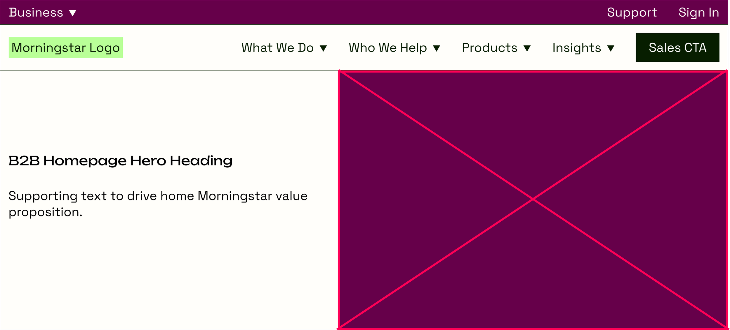
Global navigation, plain language labels, a global tophat navigation to navigate between related websites.What I proposed
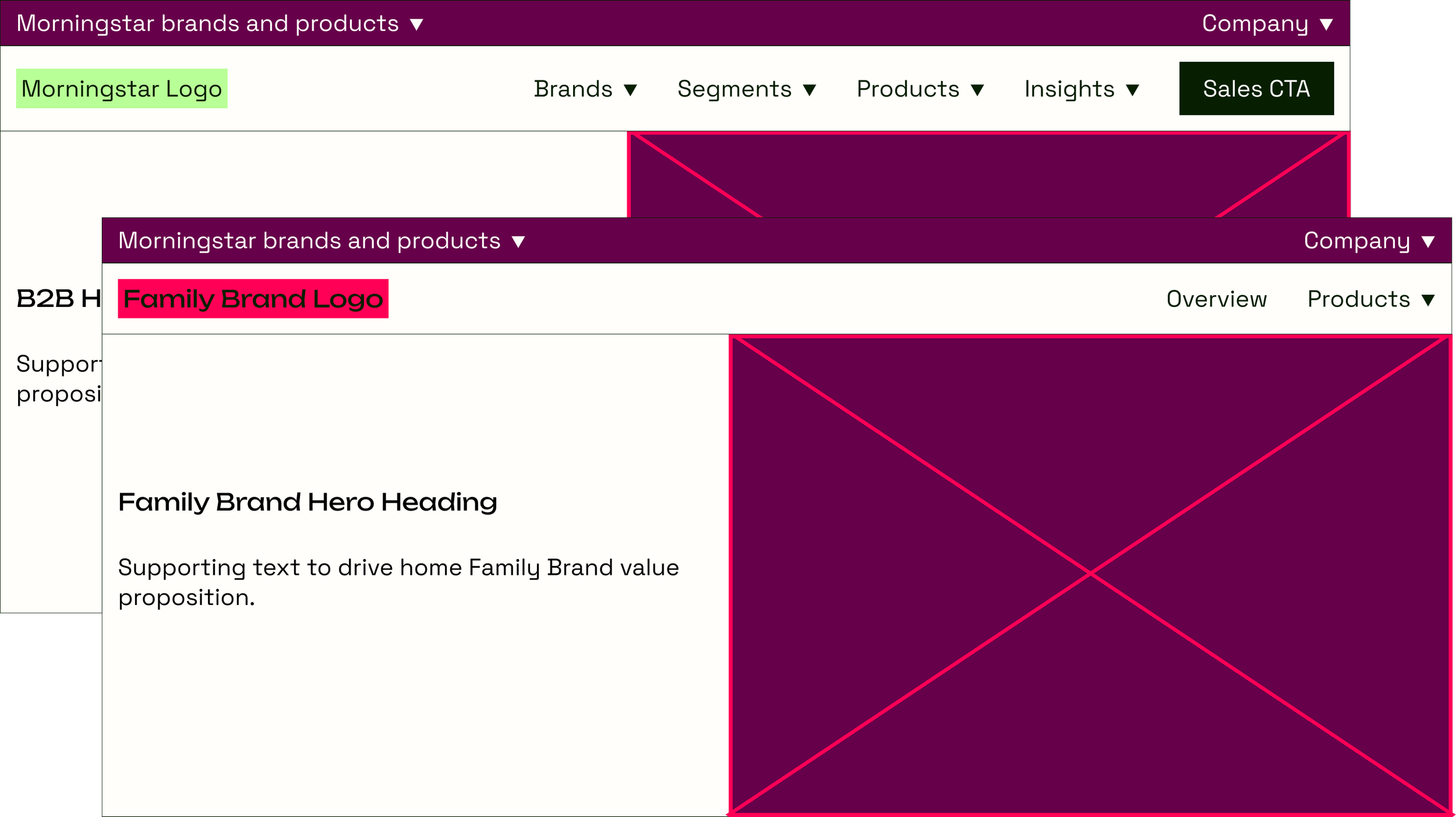
Partially global navigation, internal jargon labels, separate navigations for each of the 5 family brand experiences, a global tophat navigation that duplicated the global navigation.What Shipped
Working within constraints
With five navigations each representing a different BU (called “family brands”), I needed a way to give each one its own space without turning the Morningstar B2B site into five disconnected websites.
I developed a consistent IA for the family-brand navigations, giving each business room for its own products and content while keeping the underlying structure predictable.
It worked within the constraint, but the constraint created another problem.
Users needed to understand where they were, which navigation they were using, why it might’ve changed, and how to get from one part of the ecosystem to another.
We had successfully built the house with all of its rooms. Now we needed doors. And boy, did we explore a lot of doors until we picked “the one.”
The tophat Problem
To connect those experiences, we introduced a persistent global layer above the family brand/primary navigation.
You might know it as a utility navigation. Internally, we called it the tophat.
In theory, the tophat would give users a consistent way to move across Morningstar while allowing individual businesses to maintain navigation tailored to their own portfolios.
I didn’t love the idea of having so many navigations, but the tophat at least let me sleep at night…that is, until the powers-that-be caught wind of it and turned it into a glorified ad that trapped users in the B2B experience.

A compass that facilitates navigation between Morningstar’s separate but related web properties.
What I proposed
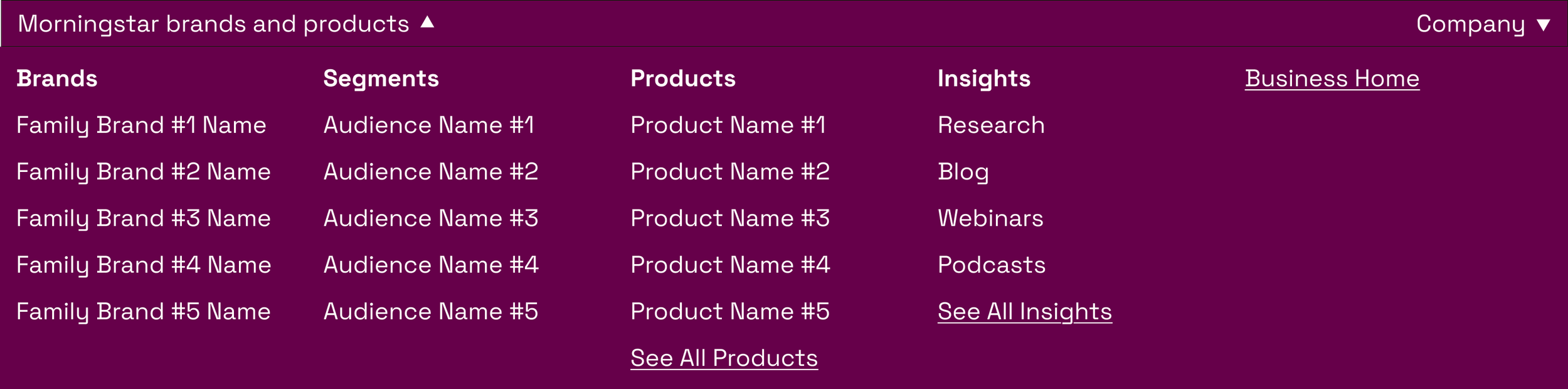
A duplication of the B2B navigation that largely facilitated users from the News site entering the B2B site at deeper levels.
What Shipped
Then the business changed
Over the next four years, Morningstar changed.
People moved. Brands evolved. Acquisitions continued. And the company's strategy increasingly shifted away from presenting its B2B business through internal family brands and toward organizing around customer-facing capabilities. As a result, the assumptions behind our 2022 navigation changed too.
I was stoked.
By 2026, we were ready to revisit the primary navigation. And conveniently, I had some thoughts.
I am not throwing away my shot
Over those four years, I built an information architecture that worked for the disparate navigation system AND for a singular, global navigation. I monitored user activity with the navigations (spoiler alert: it wasn’t great). I kept my ideal state navigation wireframes on standby until finally…
In 2025, the B2B website came under new leadership that valued a centralized information architecture and navigation system. And in 2026, my navigation doomsday prepping finally paid off.
Follow along as I click through Morningstar’s B2B navigation system on October 11, 2026.
The navigation finally got simpler
With the retirement of family brands, we could organize the primary navigation around concepts that were more meaningful to customers.
Instead of asking:
Which part of Morningstar owns this?
We could increasingly rally around:
What are you looking for?
And it took four years of waiting and organizational change to make it possible.
Outcome
In 2022, we were designing navigation around the complexity of the organization.
By 2026, we had enough shared architecture (and enough organizational alignment) to design more directly around the customer.
The work produced:
A navigation model capable of connecting previously siloed B2B businesses
A persistent global layer that gave users a consistent way through the ecosystem (which is next on the redesign block)
Four years of evidence that patience and flexibility often leads to vindication
Obviously, there’s still more work to do as of September 1, 2026.
Next up: the tophat.