
Building better benchmarks for the B2B website
How I turned a monthly “engagement went up or down” report into a measurement system that evaluates pages according to the job they were designed to do.
Role
Lead UX Designer
Project Type
In-House | Morningstar
Year
2026
How’s the website doing?
You designed a website. Great! Now, is it working?
As the UX designer, I was responsible for reporting on website engagement to leadership.
Each month, I reported on engagement rate, pages per session, and average session duration on a sitewide basis.
But that wasn’t helpful at all.
Thinking critically
I hated the way I reported on engagement. The more I thought about it, the more obvious the issue became:
Engagement rate is a great metric, but it doesn’t equate to success for every page type…
We want users to read a Product page, stay a while, click to an add-on page, or click the Contact Sales CTA.
We want users visiting the All Products page to browse and eventually click away to a Product page.
We want users visiting a Research Report page to share their information with us via form submission in exchange for the insights.
These are all different definitions for success.
So instead of asking: How engaged are users with our website?
I started asking: What was this page designed to accomplish, and how would we know if it did?
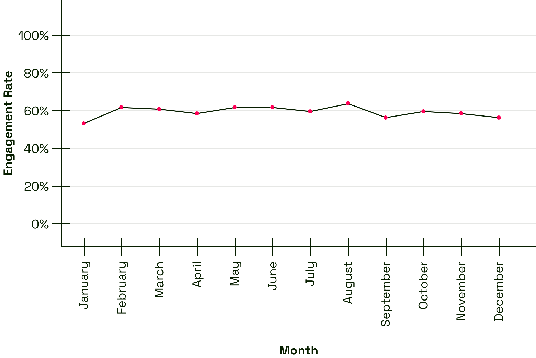
I am literally embarrassed by how I used to report on engagement.
The Payoff
This is where several years of information architecture work became extremely useful.
By this point, our B2B website was organized around a finite system of page types. Product pages shared a purpose and structure. Segment pages did too. So did Research Reports, Try pages, Capability pages, and the rest of the ecosystem.
That meant I didn't have to evaluate hundreds of individual URLs independently.
I could evaluate the system.
For each page type, I identified the primary metric that best represented what that page was supposed to accomplish.
When I stepped back, almost every page type fell into one of three jobs:
Convert. Engage. Route.

Much Better
three definitions of success
Convert pages exist to get someone to take an explicit action.
Research Reports, for example, ask users to provide information in exchange for content. Try pages ask for something considerably more consequential: a conversation with Sales.
Both convert.
They just represent very different levels of commitment.
Engage pages help users evaluate information.
Product pages fall here. Someone might arrive early in their journey to understand what a product does, or return later when they're seriously considering it. An engaged session—more than 10 seconds, two or more page views, or a key event—gives us a reasonable signal that the page helped them continue that evaluation.
Route pages are supposed to send people somewhere else.
Products All, Insights All, Segment pages, and Capability pages exist largely to help users browse and find their next destination.
In other words, spending a long time on one isn't necessarily a compliment.
For now, I use pages per session as their primary metric because it's the best signal available in our current data. Eventually, I'd like to replace it with something more direct, like referral or exit behavior.
The framework didn't make our data perfect.
It made it useful enough to ask better questions.
A benchmark for “good”
Knowing the right metric still left another question:
What's good?
Our GA4 history only went back to 2024, so I used the most recent full year of reliable data: July 2025 through July 2026.
For each success metric, I grouped the page types that shared it and calculated the median performance across those page types.
If four page types primarily existed to Engage, for example, their trailing 12-month performance established our engagement benchmark.
Now I had something more meaningful than “Engagement rate was 58% this month”.
I could ask whether an Engage page type was performing above or below what we'd historically expect from pages designed to do the same job.
And because the analysis operated at the page-type level rather than URL by URL, it could scale with the website.
Causing waves
In July, I ran the first benchmark-attainment analysis.
Three page types stood out:
Blog Posts
Client Success Stories
Research Reports
All three were underperforming their benchmarks.
When we dug into the traffic behind those page types, we noticed something else they had in common: unusually high levels of paid traffic.
Historically, paid traffic to our site has tended to be less qualified than traffic arriving through other channels. Those users naturally behaved differently once they reached the site.
So the pages weren't necessarily underperforming.
Our model was missing context.
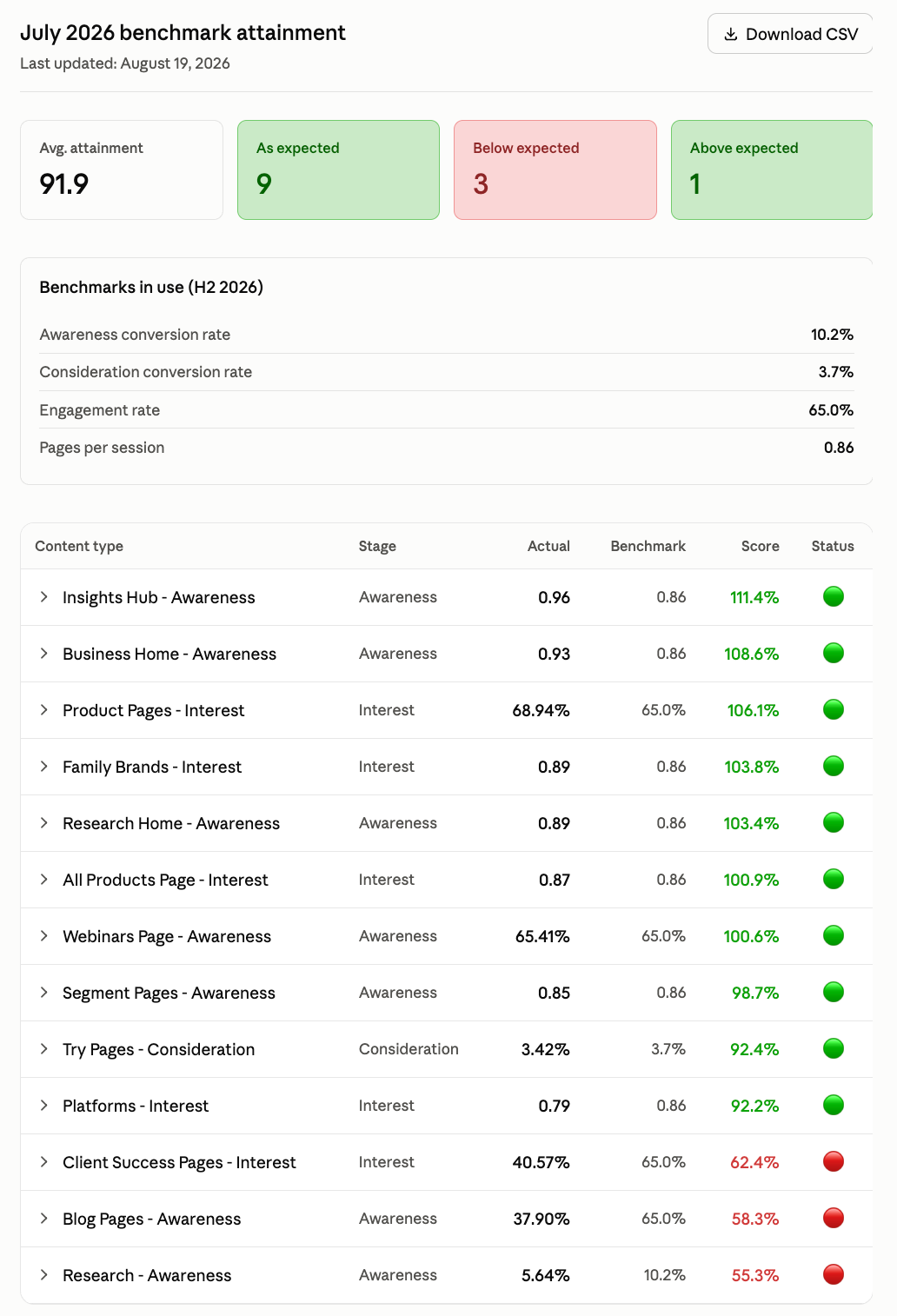
The July report card
The benchmark needed a benchmark
For the August analysis, we added traffic source into the equation.
Using the PESO model—Paid, Earned, Shared, and Owned—we could evaluate how each page type performed based on where its traffic originated.
And because those channels don't contribute equal amounts of traffic, we weighted them by session volume.
Six paid sessions shouldn't have the same influence on a Product page's expected performance as 6,000 owned sessions.
The result gave us a much more nuanced interpretation of performance.
Instead of saying: “Research Reports underperformed this month.”
We could ask: “Did Research Reports perform as expected given the mix of traffic they received?”
That distinction matters quite a bit if the next question is:
What should we optimize?
Automating the process
For my next trick, I built a Claude Skill that takes our exported analytics data, applies the benchmark-attainment logic, and produces a UX report card highlighting performance and areas that deserve investigation.
The current Skill doesn't incorporate the new PESO model yet.
That's next.
What’s next
The goal isn't to produce increasingly sophisticated reports about the website.
It's to create a reliable signal for where UX should spend its time.
As the model matures, a page type that meaningfully underperforms its expected benchmark can become a starting point for investigation: Which pages are driving the result? What's happening in the experience? What hypotheses should we test?
We're not fully there yet.
But we've gone from reporting a single sitewide number every month to building a measurement system that can tell us where to look.
Outcome
What began as an assignment to “report on engagement” became a framework for measuring whether different parts of the website are accomplishing what they were designed to do.
The work produced:
A primary success metric for each B2B page type
A Convert / Engage / Route model for grouping page objectives
Trailing 12-month benchmarks based on comparable page types
A recurring monthly benchmark-attainment analysis
A PESO-weighted model that accounts for differences in traffic quality and volume
A Claude Skill designed to automate the analysis and surface opportunities for investigation